
The first screen of a lead-generation landing page has a focused job: help the right visitor understand the offer, judge whether it is relevant, and find a clear next step. For campaigns driven by paid search, social ads, or organic content, that first impression should connect the promise that brought someone to the page with the information and form they need to act.
This landing page above the fold checklist for lead forms is a practical framework for reviewing that experience. It covers message alignment, form design, mobile usability, trust, measurement, and testing. It does not assume that every form must be fully visible without scrolling. Instead, it helps teams decide what deserves priority on the initial screen and how to validate those decisions.
What does “above the fold” mean on a landing page?
“Above the fold” refers to the content visible in the browser window before a visitor scrolls. The exact boundary changes with screen size, orientation, browser controls, zoom, and device settings, so it is not one fixed line across all visitors. On a lead-generation page, above-the-fold content commonly includes a headline, supporting copy, a visual or proof point, and either a form or a clear route to it.
The phrase can be misleading if treated as a rule that all important content must fit into one screen. People do scroll, and useful detail below the initial view may help them make an informed decision. The practical goal is to make the offer and next step understandable early, while ensuring the rest of the page supports visitors who need more context.
Above-the-fold checklist for lead forms

1. Match the page to the campaign promise
Compare the landing page headline and offer with the ad, email, social post, or search result that sent the visitor there. Use consistent language for the product, audience, problem, and action. If an ad offers a demo, the page should not appear to offer only a general newsletter. If a campaign targets a particular industry, make the page’s relevance apparent without making claims the business cannot support.
This is especially important in paid ads and PPC optimization. A click can be correctly attributed while the page still fails to meet expectations. Review the entire path—from targeting and creative through the page and form—rather than treating the page as a separate asset.
2. State the value proposition plainly
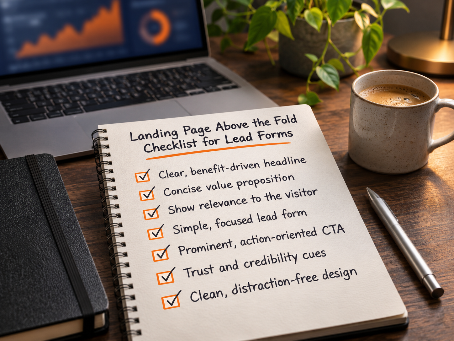
Write a specific headline that identifies what is being offered or what problem the offer addresses. Add concise supporting copy that explains who it is for and what happens after submission. Avoid vague claims such as “transform your business” unless nearby details explain what that means. A visitor should not have to infer whether the offer is a consultation, software trial, quote, guide, or event registration.
3. Make the next action easy to recognize
Give the main action a clear visual treatment and a descriptive label. “Request a consultation” tells a visitor more than “Submit.” Keep competing actions restrained when the campaign has one primary conversion goal. If there is a legitimate alternative, such as viewing a product overview, make the distinction clear so visitors understand which action requires a form.
4. Decide where the form belongs
For a straightforward offer, showing the form near the headline can reduce the effort needed to begin. For a complex or high-commitment offer, a short introduction and a clear button that moves to the form may give visitors useful context first. A form can also sit just below the first screen if the opening section makes the next step obvious. Choose based on the offer, audience, and evidence from testing—not on a universal rule about form placement.
5. Ask only for useful information
List every requested field and state why the business needs it. Name and work email may be enough for an initial inquiry; additional qualification fields may be appropriate when they support a real follow-up process. Each extra field creates effort and can raise privacy concerns, but removing a field can also reduce the information available to route or respond to a lead. Test meaningful alternatives and assess lead quality alongside form completion.
Label fields visibly, identify required fields, use input types suited to the data, and provide helpful error messages. Do not rely on placeholder text as the only label: it disappears as people type and may be difficult to interpret. If a field has an unusual format, give an example or explain it near the field.
6. Explain what happens after submission
Set expectations close to the form or call to action. Explain whether the visitor will receive a resource, be contacted by a representative, or move to a scheduling step. If response times are mentioned, make sure the organization can meet them consistently. Avoid implying that submission guarantees a particular result.
7. Place trust and privacy information where it helps
Use genuine, relevant proof: a verifiable customer quote, a clearly identified credential, or a concise explanation of the organization’s experience. Confirm that you have permission to publish testimonials and that any results are presented with adequate context. Link to a privacy notice near the form and explain how information is used. A privacy statement should reflect actual practices rather than serve as decorative reassurance.
8. Check mobile and accessible use
Review the page on common mobile screen sizes as well as desktop. Confirm that the headline remains understandable, the form is easy to reach, fields are comfortable to use, and the submit control is not obscured by a fixed banner or keyboard. Test keyboard navigation, visible focus, text contrast, labels, and error announcements. The W3C Web Content Accessibility Guidelines (WCAG) provide a recognized framework for evaluating accessibility; a visual review alone is not a substitute for testing.
9. Keep the page focused without hiding essential information
Remove navigation or decorative elements only when doing so serves the visitor and does not block useful routes or context. A minimal page can focus attention, but excessive simplification may make an unfamiliar brand seem untrustworthy or leave important questions unanswered. Include enough information to support a considered decision, with deeper explanations below the opening section where appropriate.
10. Check speed, rendering, and tracking
Verify that the headline, form, and primary action render correctly on the devices and browsers that matter to the campaign. Compress oversized images, review third-party scripts, and test the page under realistic network conditions. Google’s documentation on Core Web Vitals describes user-focused loading, interactivity, and visual stability measures; use it as a diagnostic reference, not as a guarantee that a particular design will convert.
Confirm that analytics record the intended events, such as a valid form submission or a completed booking—not merely a button click. Check that consent settings, tags, and redirects behave as expected. For campaigns using multiple channels, document how conversions are attributed and where reporting may be incomplete.
Practical review and testing steps
- Map the journey. Record the source, audience, campaign promise, landing page, requested action, and follow-up process. This connects paid media, social campaigns, SEO and content strategy, and email marketing automation to one visitor experience.
- Capture representative views. Inspect the page on desktop and mobile, with realistic browser chrome and zoom. Note what is visible without scrolling, but also test whether visitors can find the form and supporting details farther down.
- Run a message-and-form review. Ask someone unfamiliar with the page to identify the offer, intended audience, required action, and what happens next. Check whether form labels and privacy information are clear without coaching.
- Establish a baseline. Track qualified visits, form starts, valid submissions, completion rate, lead quality, and downstream outcomes where available. Segment results by channel, device, and relevant audience groups. Do not treat raw submission volume as the only measure of success.
- Prioritize a testable change. Form a specific hypothesis, such as: “Clarifying the follow-up process near the form may increase completed submissions without reducing lead quality.” Change one meaningful element or use a well-defined experiment so the result is interpretable.
- Review the whole funnel. Connect page results with sales acceptance, booked meetings, opportunity progression, or other agreed business outcomes. Marketing analytics and attribution can help compare channels, but attribution models are representations of a journey, not perfect proof that one touchpoint caused a result.
- Document and repeat. Record the version, audience, dates, tracking setup, and decision. Retest when the offer, traffic mix, form process, or page technology changes. Avoid declaring a winner from a small or unrepresentative sample.
Benefits and trade-offs of a form above the fold
Potential benefits
- Visitors who already understand the offer can begin without searching for the form.
- The page makes the conversion path visible, which can be useful for direct-response campaigns with a simple offer.
- Teams can quickly inspect whether the campaign promise and action are apparent on the initial screen.
Potential drawbacks
- A prominent form can feel premature when the visitor needs more information to evaluate a complex service or high-commitment request.
- Fitting too much into a small screen can create clutter, cramped fields, or a weak mobile experience.
- Prioritizing form completion alone may encourage unnecessary data collection or increase low-quality leads.
- A form placed lower on the page may require more scrolling, but the surrounding explanation can help some visitors make a more informed choice.
These trade-offs are reasons to test contextually, not proof that one layout is always better. A B2B lead-generation page for an enterprise service may need more detail than a page offering a short downloadable checklist. The right balance depends on visitor intent, risk, sales process, and the value of the requested information.
Limitations and common measurement pitfalls
An above-the-fold review cannot explain every cause of poor campaign performance. Audience targeting, offer relevance, ad quality, page speed, sales follow-up, seasonal demand, and tracking errors can all affect outcomes. A higher form completion rate is not necessarily an improvement if qualified leads decline or follow-up becomes less effective.
Analytics may also miss conversions because of consent choices, browser restrictions, cross-device behavior, or implementation problems. Use consistent definitions, validate events, and compare multiple indicators. If a test has too little traffic or runs through a major campaign change, report the uncertainty rather than presenting the result as conclusive.
For broader guidance, consult the Nielsen Norman Group’s research and articles on scrolling and attention, the Google Ads Help documentation on landing page experience, and the W3C WCAG standards and guidelines. These sources address related usability, advertising, and accessibility considerations; they do not establish a universal best-performing fold layout. Apply them alongside analysis of your own audience and funnel.
Concise Q&A
Should every lead form be visible without scrolling?
No. Make the offer and next step clear early, then choose form placement based on visitor intent and the amount of context needed. Test the alternatives where traffic and measurement support a useful comparison.
How many fields should a lead form have?
There is no universal ideal number. Request information that supports a defined business purpose, and evaluate completion together with lead quality and follow-up outcomes.
Should a landing page remove its navigation?
Not automatically. Reducing distractions can help focus a campaign, while navigation or additional links may provide useful context and trust. Make the choice according to the page’s purpose and visitor needs.
What should be measured besides submissions?
Consider form starts, valid completions, qualified leads, sales acceptance, booked meetings, and later funnel outcomes. Use attribution reports carefully and document how conversions are defined.
Conclusion
A useful above-the-fold checklist is not a demand to squeeze an entire landing page into one screen. It is a way to ensure that visitors can quickly recognize the offer, understand the action, and access a usable, trustworthy form. Align the page with its campaign, request only necessary information, support mobile and accessible use, validate tracking, and test changes against lead quality as well as conversion activity. That approach can connect landing page design and testing with PPC optimization, CRO, attribution, and the wider performance marketing process.
Informational disclaimer: This article offers general marketing guidance, not a guarantee of campaign or financial results. Follow applicable privacy, consent, accessibility, and advertising requirements, and seek qualified legal or compliance advice when needed.
Leave a Reply